Prototyping Improvements to a Job Tool
With the Minnesota Department of Human Services

The Opportunity
According to Minnesota’s Department of Human Services, in 2022, approximately 11,235 children and youth experienced out of home services, also known as foster care. These out of home cases are handled by passionate and empathetic case workers whose primary goal is reunification- to help these parents access resources and learn skills to create a safer and healthier environment for their children in order to reunite them.
One of the case workers’ most difficult tasks is filing and reviewing with parents an Out of Home Placement Plan (OHPP), which is a lengthy document detailing the steps a parent needs to take in order to reunite with their child or children. The program used by the case workers to file the OHPP allows for a wide variety of circumstances, however it neglects to inform the users which fields are required, while also failing to recognize fields that are irrelevant to a particular child, making this an extremely cumbersome ordeal.
The Solution
After speaking directly with case workers, I understood the need for prominent signifiers and appropriate constraints, while still maintaining flexibility within the program, as each case has its own unique circumstances. Case workers don’t always have all of the information necessary to complete the OHPP at once. Users often need to leave the document and come back to it at a later time.
The main focus of this project was adding a progress bar to assist the user in returning to fields left incomplete, while also indicating which fields are required. Additionally, a child profile was added to the beginning of the document, which would allow the program to eliminate unnecessary fields. The added visibility and customization of the form serves to greatly decrease the amount of cognitive effort needed to review and complete the document.
Project Length: 1 weeks
My Roles:
UX Designer
UX Researcher
Tools:
Figma
Figjam
Procreate
Google Suite
Zoom
Methods:
Cognitive Walkthrough
Contextual Inquiry
Personas
Heuristic Analysis
User Flows
Lo-Fi Wireframes
Interactive Prototype
SPEAK! Hearing From the Users
Pre-Existing Wireframes
Our team was fortunate enough to have received a prototype from a previous round of research and design. While we made many visual changes, it served as a foundation for our information architecture. We were able to jump right into usability testing and determine a strategy for our designs.
Usability testing uncovered many areas of focus, but given the limited time frame, the team decided to narrow down the focus to improving the visual experience of the app, personalizing the content in the Information Hub, and making the Poop Detective easily accessible and understandable.


Early Wireframes
-
![]()
Poop Detective
-
![]()
Home
-
![]()
Information Hub
-
![]()
Health Records
-
![]()
Speak with a Vet


Getting Users to Talk Sh!t
Managing Doggy Healthcare
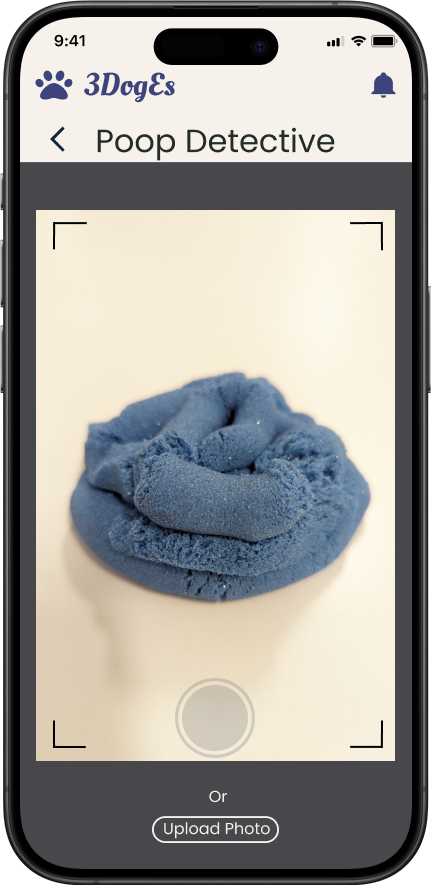
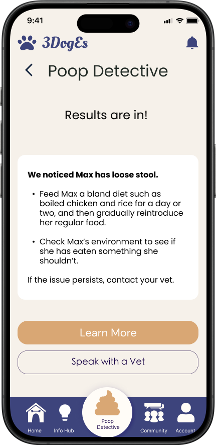
Our client was very clear: When it comes to a dog’s care, the number one test is your dog’s number two. The Poop Detective was created to use artificial intelligence to analyze dog stool and provide insight on the dog’s health.
During our kano analysis, we found that 14 out of 16 users were thrilled to have an easy way to track their dog’s health without an extra visit to the vet.
Poop Detective Screens
-
![]()
Camera
-
![]()
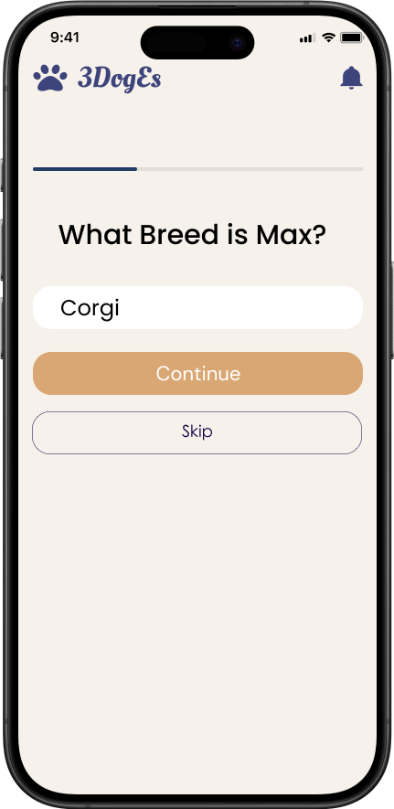
Choose a Dog
-
![]()
Picture Captured
-
![]()
Results
-
![]()
More Information


Old Dogs Can Learn New Tricks
Bite Sized Information
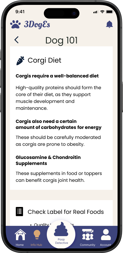
Early interviews with users showed us the lengths dog owners were willing to go through to learn about their pet. Users spent hours digging through articles and paid a fair amount of money for training programs- time and money that would have been better spent on their dog. We found that users needed a single resource for all of their dog’s needs, including diet, exercise, and training.
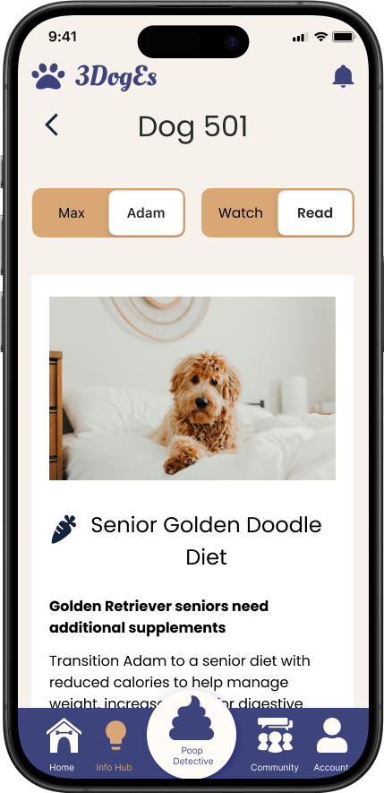
The Information Hub is designed to provide users with information and resources specific to their pup, eliminating the painful research process. Upon the first log in, users are prompted to enter as much information as they can about their dog, including breed, age, and activity levels, to create a Doggy Profile. The Information Hub then presents the related learning and training materials in short-form videos or easily scannable articles, reducing the cognitive load on the user.
Information Hub Screens
-
![]()
Collecting Information
-
![]()
Doggy Profile
-
![]()
Information Hub
-
![]()
Short Form Videos
-
![]()
Articles
-
![]()
Personalized Information
-
![]()
Scannable Content


Doggone!
Our Challenges
Our biggest challenge lied in motivating users to act upon the information they learned within the app. We discussed many options, such as social challenges and streak rewards, however these tested poorly with users. The users were already motivated by their dog’s well-being, but they were still failing to act on the available information.
Revisiting the research, we noticed that users had multiple websites and apps for tools and resources. They also complained of having to sort through irrelevant or alarming and exaggerated information. Users were wasting too much time and energy looking for information, taking away from their ability to truly care for their dog. This understanding led our design decisions for the rest of the project.
In order to meet the challenge of eliminating the stress of searching through multiple resources, we customized the content in the Information Hub so only information relevant to the user’s dog breed, activity levels, and other metrics would be provided. This serves to cut down on the excess noise and remove the time-consuming effort of sorting through irrelevant articles online. Users also needed a single place to track their dog’s health records, including immunizations, medications, and activity levels, which allowed for further personalization of the content provided.
The majority of dog owners (85%) and cat owners (76%) consider their pets to be members of the family.
— Forbes Advisor
MUSH!
Moving the Project Forward
A primary feature the client was interested in was the ability to use artificial intelligence to connect users with personalized information. Unfortunately, testing revealed that users were hesitant to engage with the AI chatbot. They voiced concerns about the validity of the information provided, and preferred the option to speak with a live veterinarian instead, even if it meant a longer wait.
With this in mind, the team felt that there was still an opportunity to further utilize an AI chatbot in order to reduce the already overwhelming workload on vets. Research would needed to determine the best way to gain a user’s trust in this feature.

Drop It!
Conclusion
Most dog owners consider their dogs to be family, and as such, owners want the best for their pets. Currently, users spend a large amount of time, energy, and money across multiple websites, apps, and programs to provide the best care for their dogs. This process can be overwhelming, and can lead to inaction, which can be detrimental to a dog’s health.
The 3DogEs app aims to provide users with a single source of information customized to their dog’s breed and health. By providing users with easy-to-understand content, 3DogEs greatly reduces the cognitive load and stress of searching for material specific to their dog’s healthcare and well-being, allowing users to redirect their energy and focus where it belongs- on their furry family.